TripleTen
TripleTen is a personalized learning service that takes you from gaining skills to employment. Named by Fortune as the best overall tech bootcamp in the US, it has over 20k monthly active learners across the US and Latin America. TripleTen is a part of Nebius, a $20B NASDAQ-listed AI cloud company. This is also the funniest place I’ve ever worked.
The product was born in the early 2020s, when switching to tech became a real path to stability and a better life for many. TripleTen became the best way to learn a tech job for people with busy lives, thanks to its mix of full control over the student experience, strong learning design, and deep expertise in tech and AI.
I joined TripleTen as part of the founding team and spent four years shaping its product design. Over time, I took on broader design leadership across the organization—supporting other designers while keeping my sleeves firmly rolled up.
Dot , your AI buddy
One of the biggest challenges in online learning is the lack of real-time support. That’s why tutors, learning coaches, and the community became one of TripleTen’s core strengths. But keeping that level of depth and quality consistent is really hard once you start scaling.
AI changed that. In 2025, with the rise of reasoning models and agents, smart and responsive AI tutors suddenly became possible. That’s how Dot was born.
Dot started as a quick experiment on our Discord server. Over the year, I saw how much students loved it and pushed to turn it into a part of the platform.
We chose to start where students struggled most—coding projects. So I designed the chat as a VS Code extension first.
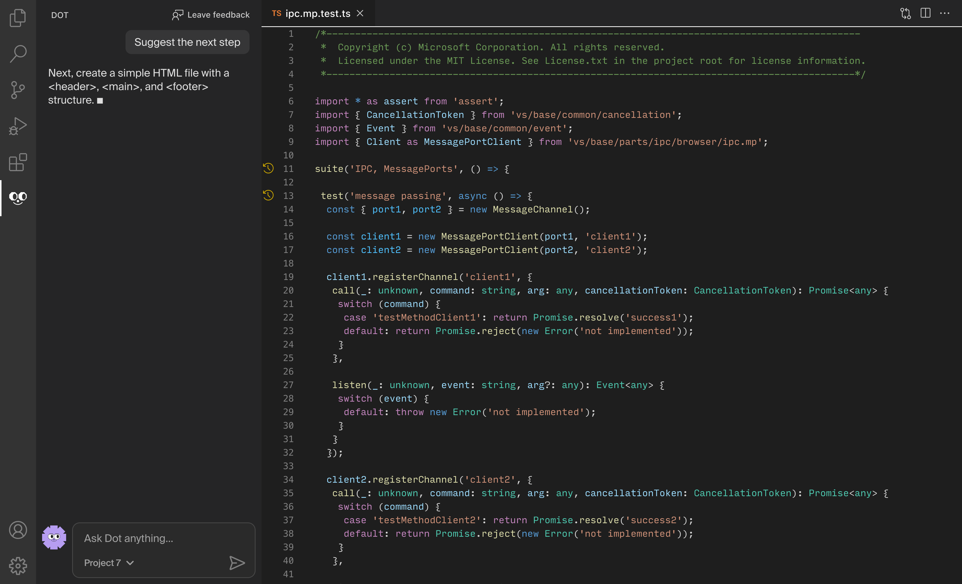
From the start, we shipped to learn. We built a simple chat, added events and feedback loops, and watched what, when, and how students asked. (A good moment to shout out PostHog’s surveys, analytics, session replays, and feature flags.)
Very soon after launch, we saw heavy usage of the extension, confirming that the entry point was right and this kind of help was genuinely valuable. Our next step was to identify other key moments where students needed support most.
Over the next six months, together with a small team of engineers and researchers, I iterated on Dot’s conversational experience, tools, memory, voice mode, and these entry points across the whole learning journey.
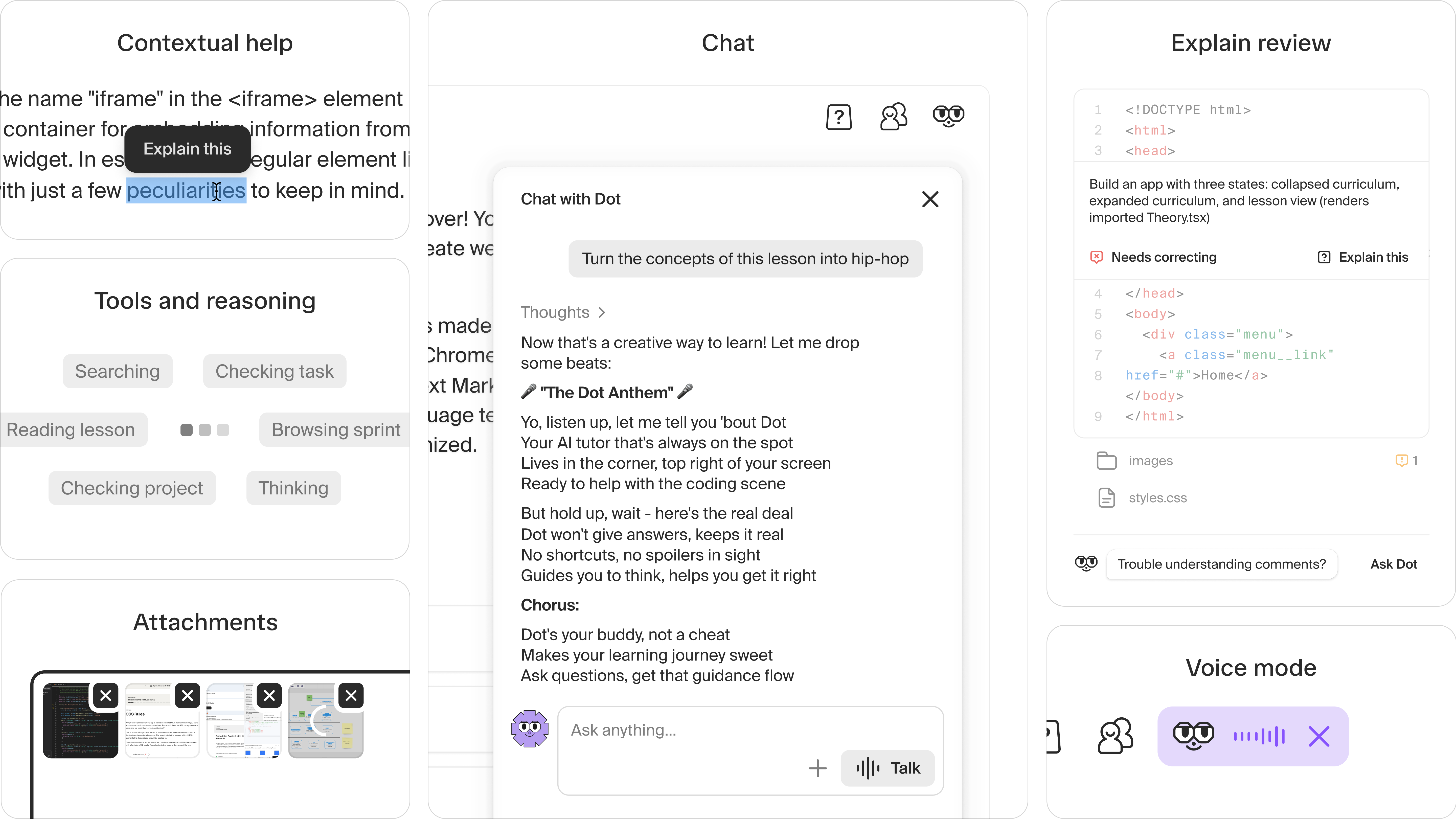
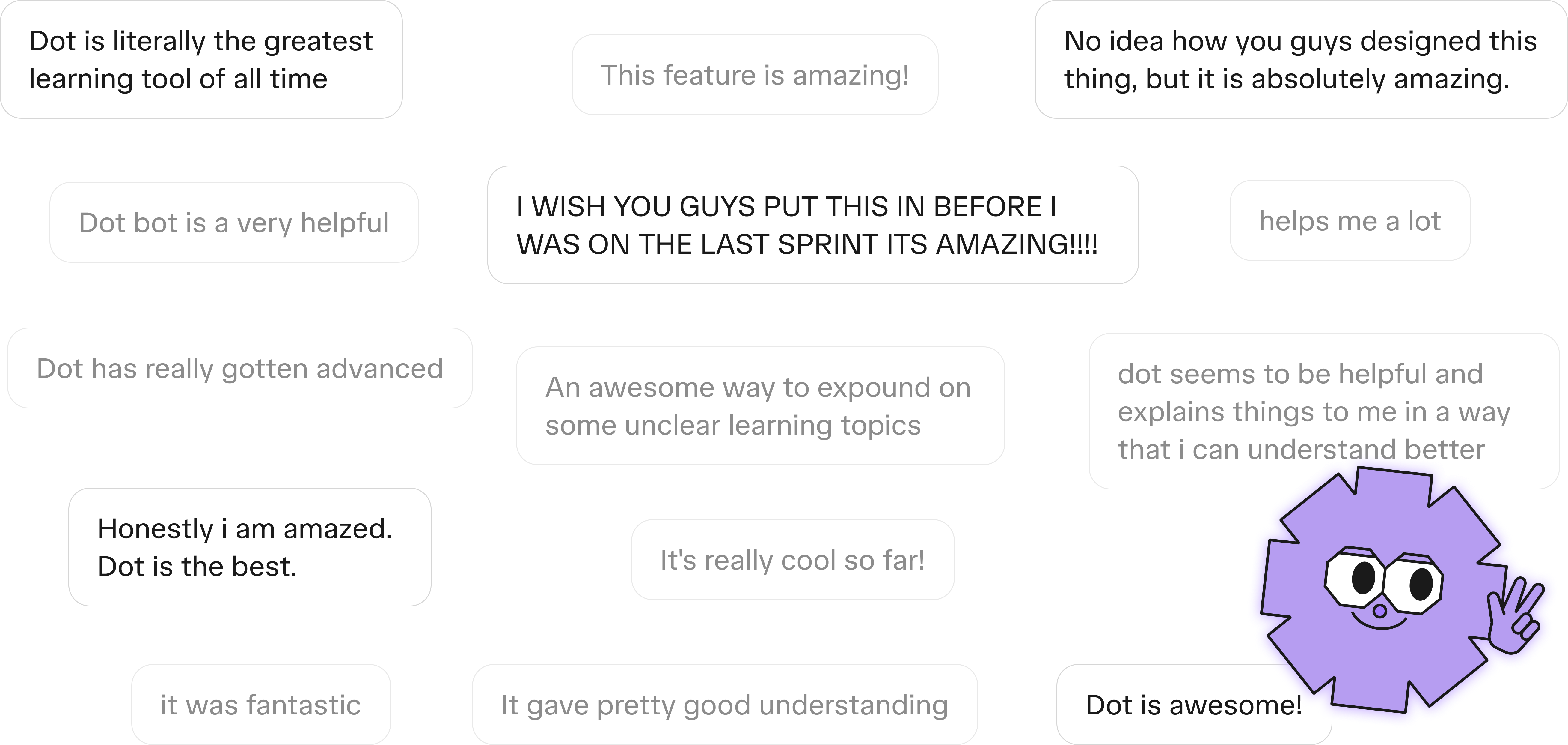
Together, we managed to make Dot feel like a real buddy who shows up right when you need help. The impact was clear in our A/B tests: Dot increased project submissions by 34%. It quickly became the most-used support tool, with 47% MAU and over 200k messages sent each month. Equally important, Dot’s lively personality and tone of voice brought widespread love, tons of positive feedback, and a 91% satisfaction rate.
Projects on the platform
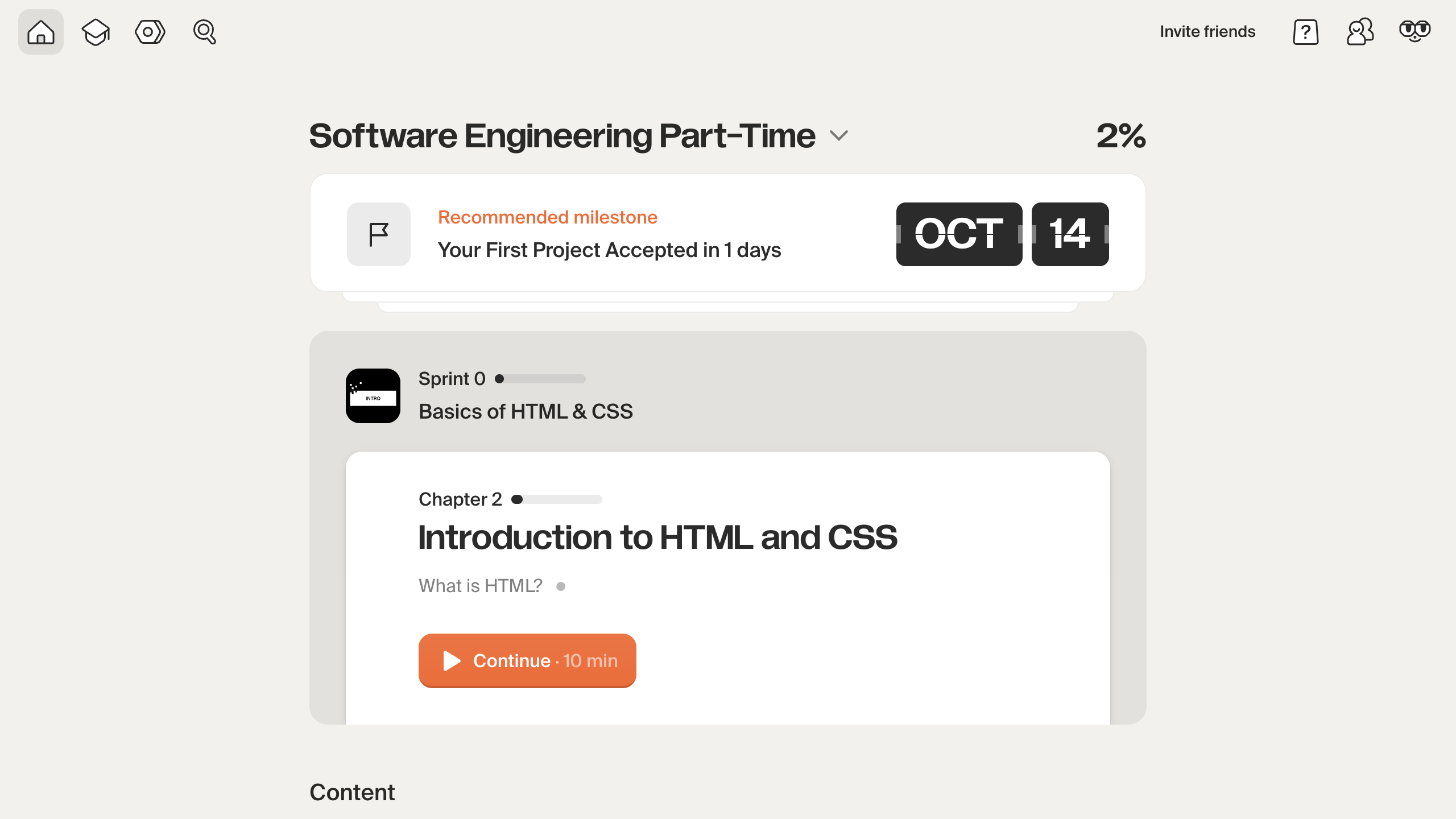
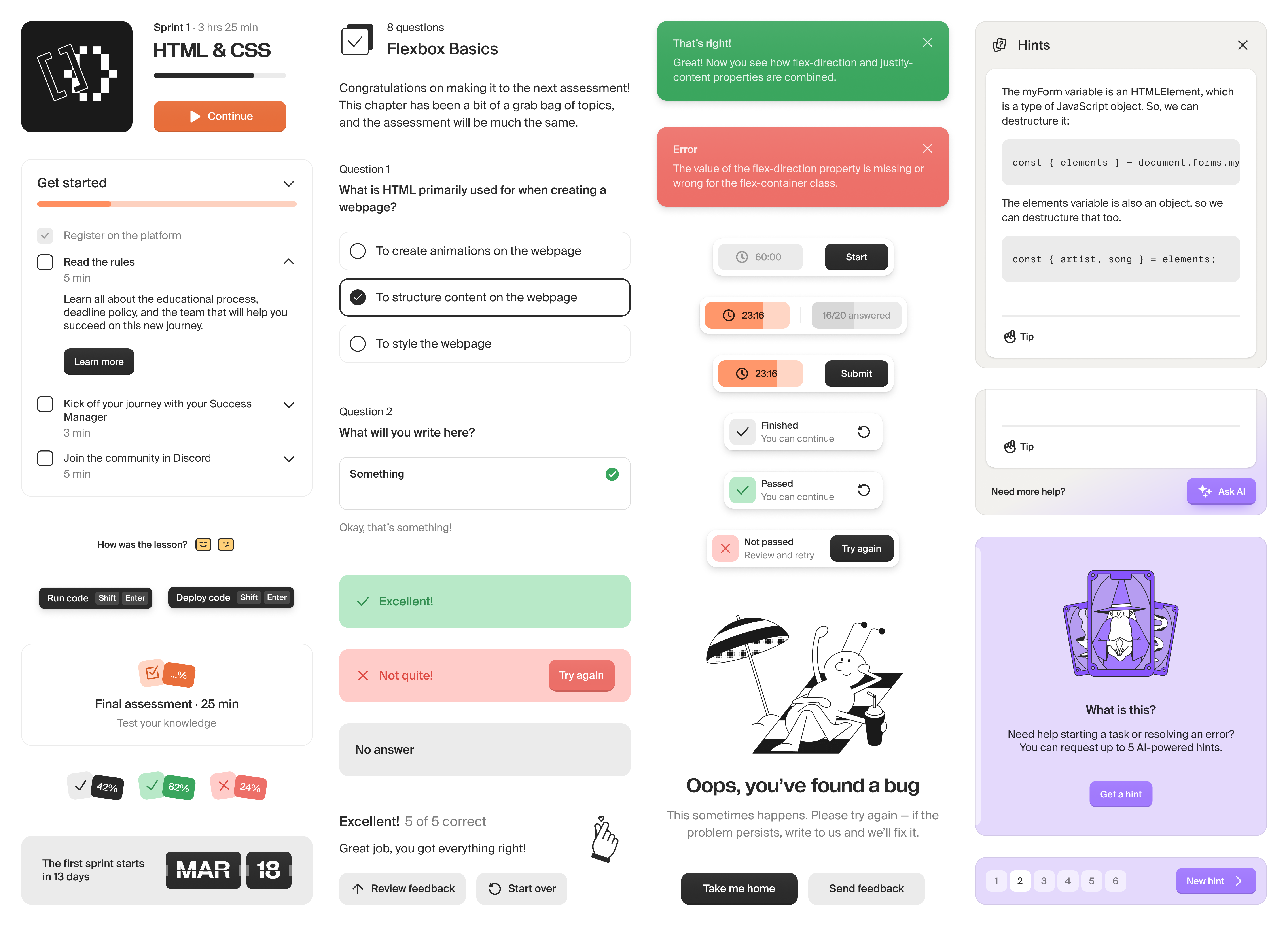
TripleTen’s approach is built around project-based learning, and study projects are the biggest, most complex part of it.
In the past, these projects required installing a bunch of external tools, while the platform itself was mostly a textbook with instructions. Once you started a project, you were on your own, setting up a complex coding environment locally. That created a painful UX barrier for students and a blind spot for the product team, since we had no visibility into the part where students spent most of their time.
So we brought these tools into the platform. Today, most of the professional tools students use (VS Code, JupyterLab, Google Sheets, Figma, and more) are web-based, which made it technically possible.
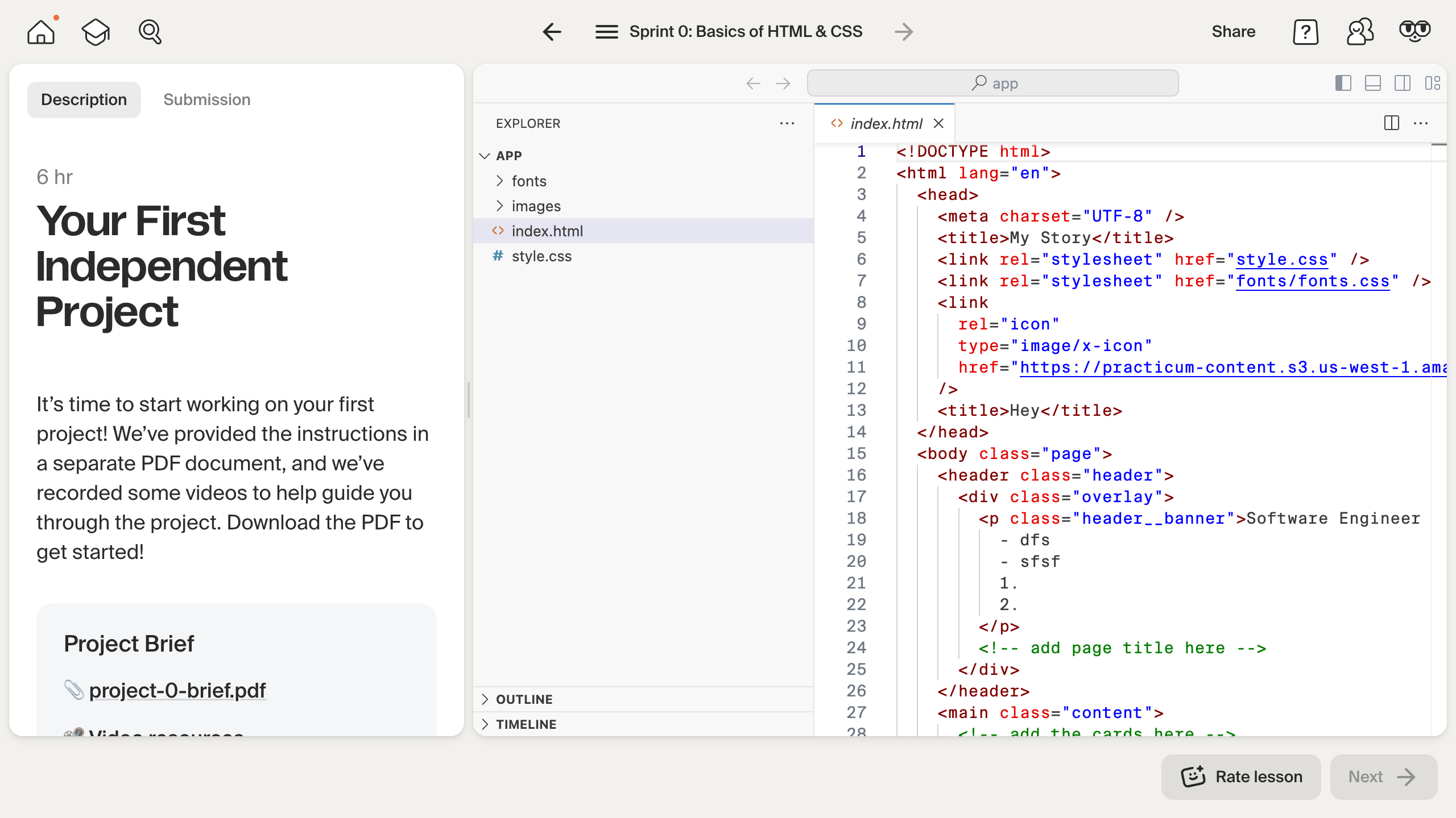
This challenge meant I had to rethink the whole lesson layout so students could work comfortably in a complex environment while still having easy access to all platform tools. The goal was to make a workspace feel like the same familiar place.
Another major challenge was simplifying the stages model. Project workflows used to get pretty complex, so I had to make them much clearer. In the end, each project now has just a few straightforward steps. At the same time, the layout and view of each step adapt depending on the project type and stage.
It was a fun design project but also a big technical one—especially when it came to making the platform and external workspaces work seamlessly together. With a tight-knit team of engineers, we built the first VS Code version in three months, but the full rollout, iterations, and support for more tools took another year.
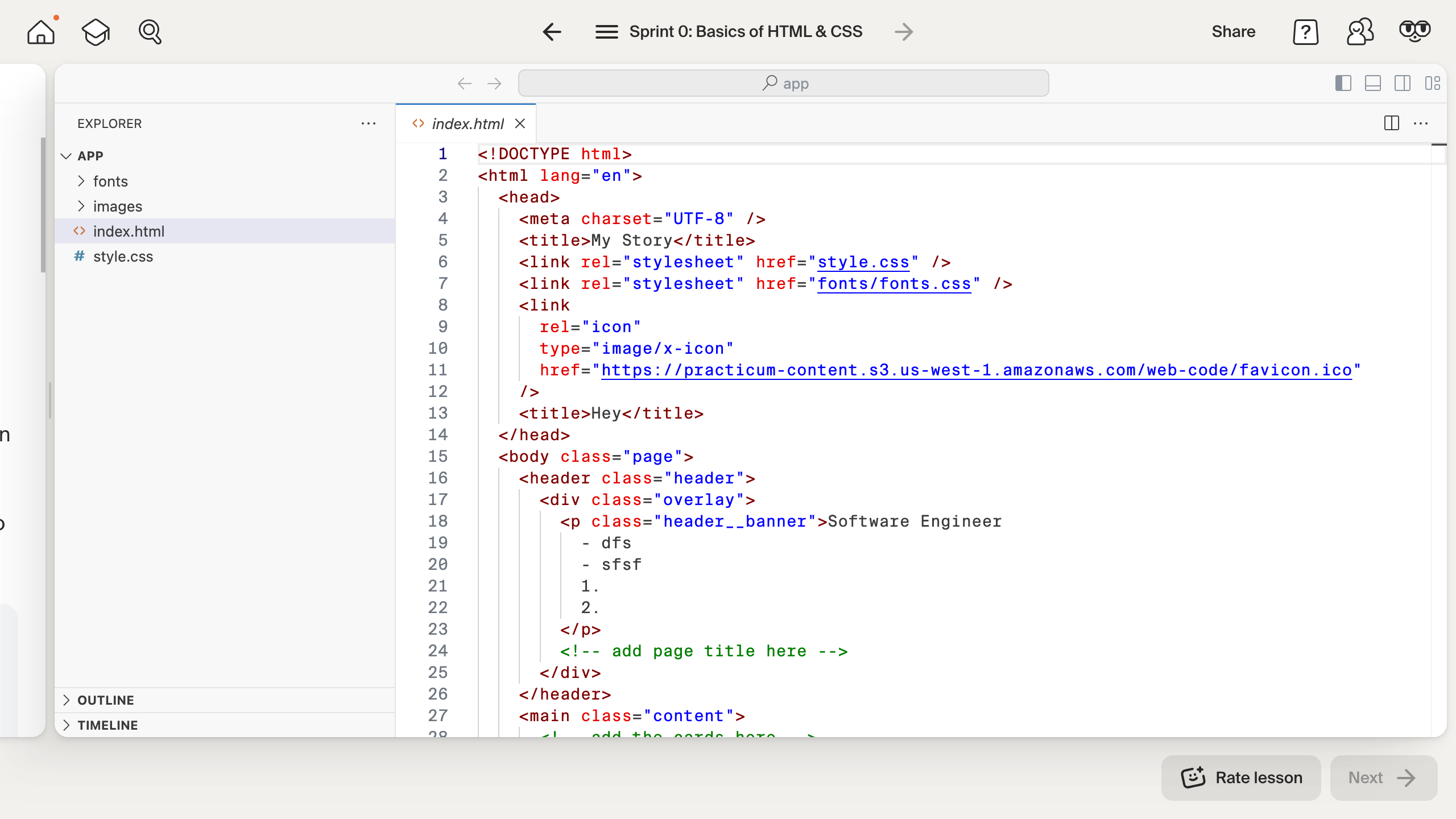
As a result, projects became a native part of the platform. Students can now work on them without the hassle of setting anything up locally, and they have easy access to all support tools. Besides that, the team now has full visibility into what happens during projects because the entire learning process lives inside the platform. Students now spend 31% of their time in the new project workspace, which also makes running support experiments much easier.
Visual language
One of the things I truly loved at TripleTen was shaping its visual language and bringing the brand’s voice into the interface. During my time there, I was the key maintainer of our shared design system.
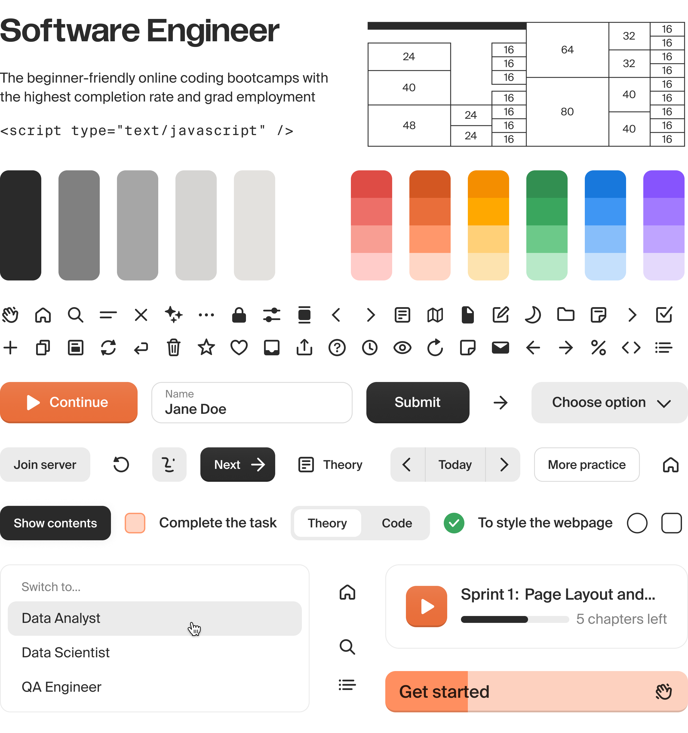
One of the hardest challenges was keeping everything consistent and helping the other 25 designers across product, brand, and curriculum teams align and contribute effectively to the shared system. To make things easier, I broke it into several modules—from broad foundations to more specific UI libraries, brand components, and curriculum guidelines. These Figma files, and the shared approach behind them, took shape through regular design critiques and a steady design-system routine.
This collaboration between different design functions was crucial in shaping TripleTen’s unique tone of voice. I always wanted learning to feel approachable, supportive, and not boring. That’s why our ToV showed up not only in the copy but also in the smallest details of the interface.
In my last year, I took this further by stepping into design engineering, shaping not just visuals but also interactions and polish. My code contributions added up to 47 PRs across new features, papercuts, and analytics.
Observability
In my last year at TripleTen, one of the big things I focused on was helping us understand how students actually study on the platform. Our product analytics setup was quite limited, and we had almost no way to observe real student behavior. We often didn’t know whether what we shipped actually worked. UI decisions lacked context, and we mostly relied on personal opinions.
When I researched analytics tools, one clearly stood out—PostHog. Beyond all the hog fun, it turned out to be a powerful and flexible observability toolkit.
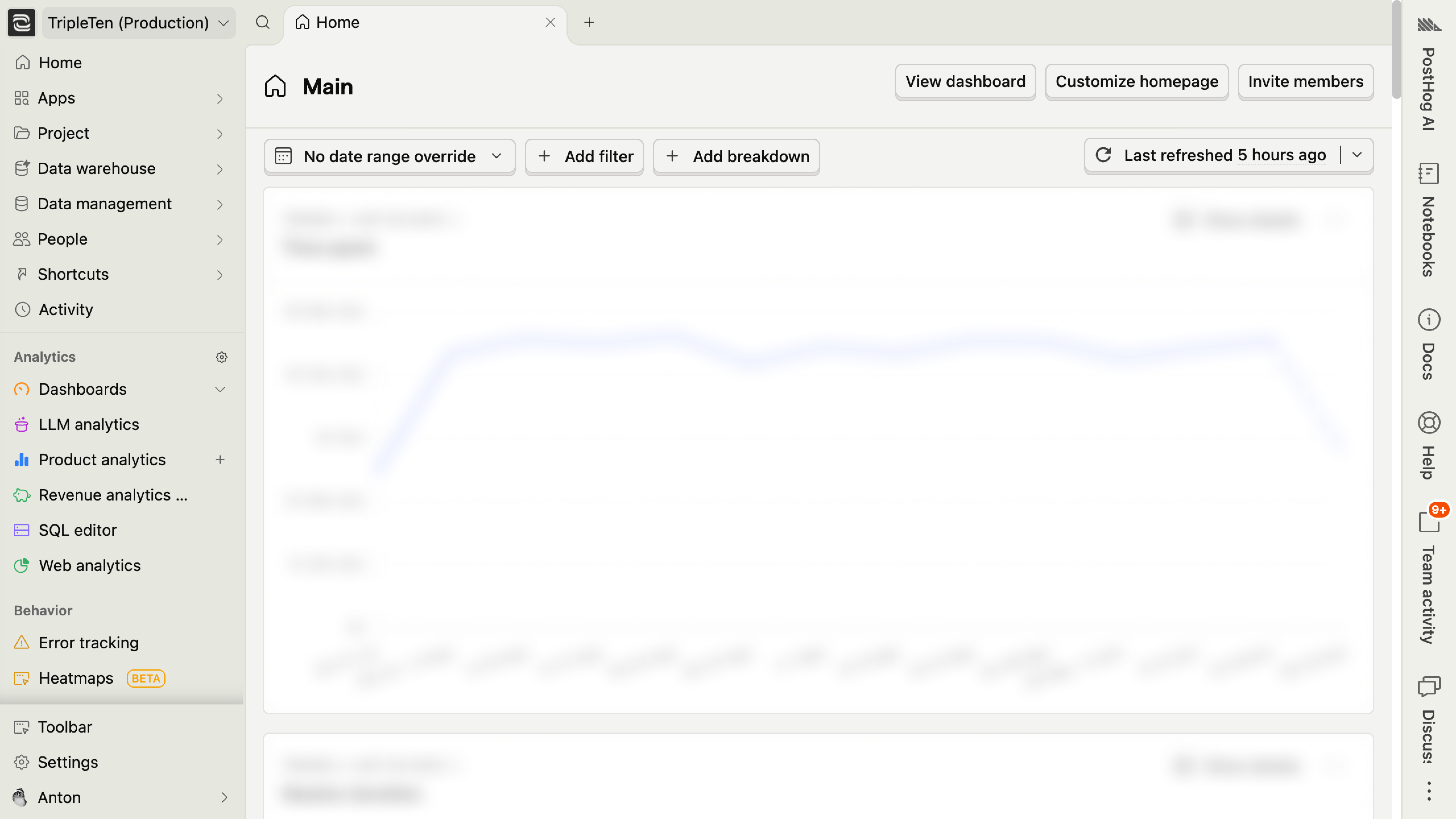 PostHog toolset
I set up and maintained the PostHog integration from early experiments to a full rollout across all platform surfaces. It was an interesting challenge because it combined setting up structure inside PostHog, maintaining integration code, resolving issues, and driving awareness and adoption across the company.
Over time, PostHog became the core analytics and experimentation platform for the product team and was broadly adopted across the org. Here’s what we did with it:
- Iterated on freshly released features based on usage data, session replays, and survey feedback.
- Ran experiments to measure impact—from getting 72% more feedback responses by tweaking a button label to proving that 34% more students submit their projects with Dot support.
- Started rolling out new features gradually using feature flags.
- Unshipped several low-usage features based on insights from automatically captured data.
- Moved student activity tracking for the learning support team from a clunky in-house system to reliable PostHog events within the main infrastructure.
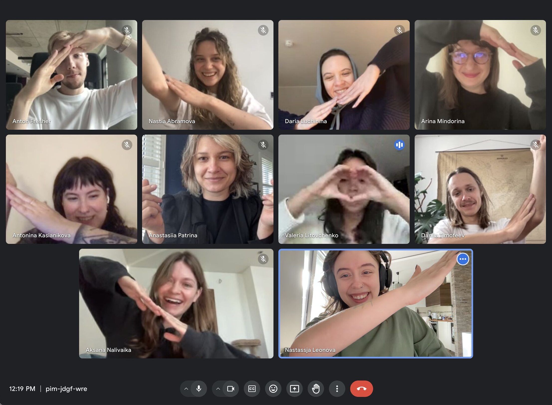
Team
The best part of working at TripleTen was connecting with so many amazing people. TripleTen was always a lot of moving parts: tech folks building the platform, education experts shaping curriculum, support teams, career services, and more.
I started in a small engineering team focused on the platform. Later I took on projects with curriculum, support, and others. I tried to make design a glue that tied the whole experience together and kept us from sliding into Conway’s law. Over four years I went through so many different team setups that it honestly felt like working in several different companies.
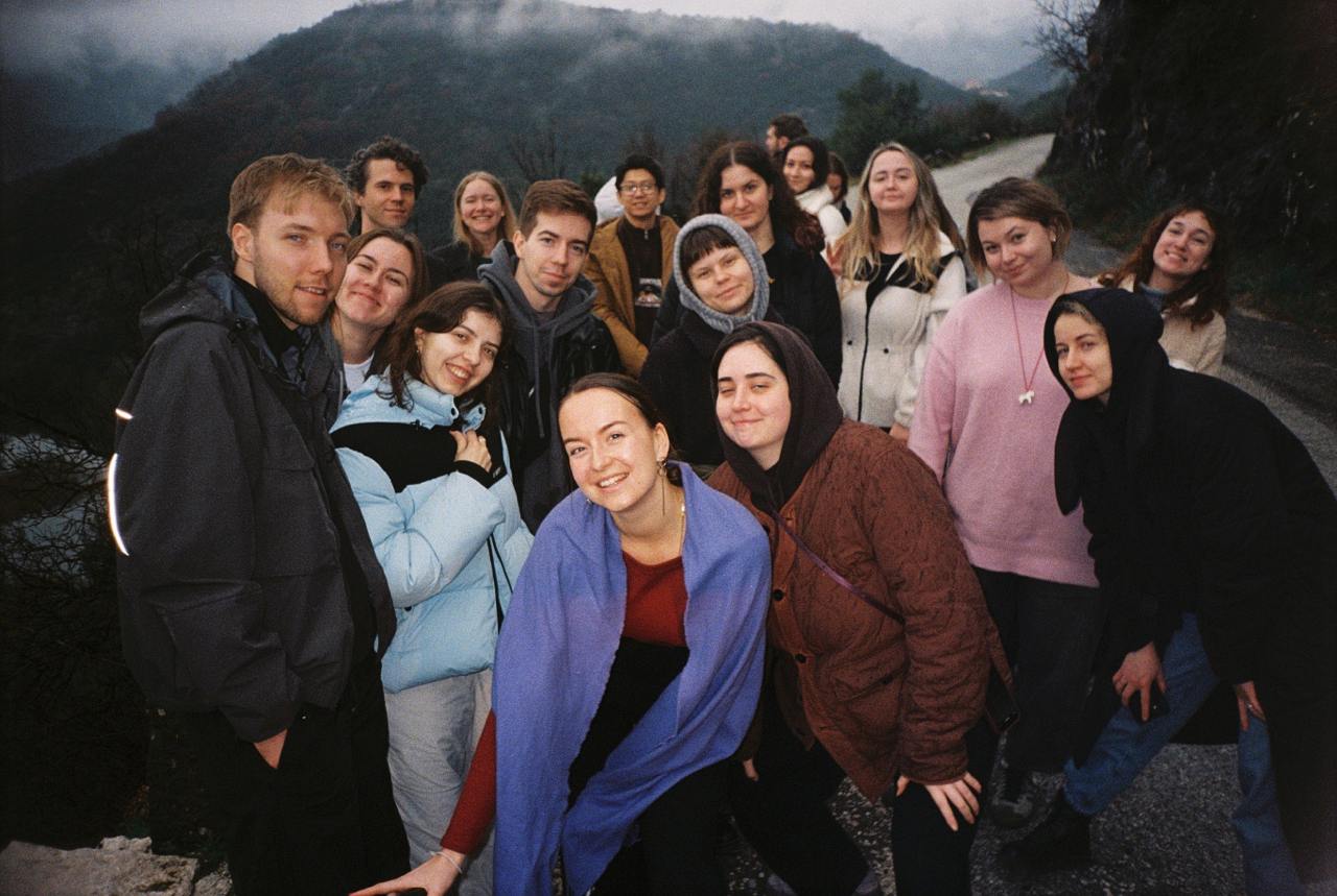
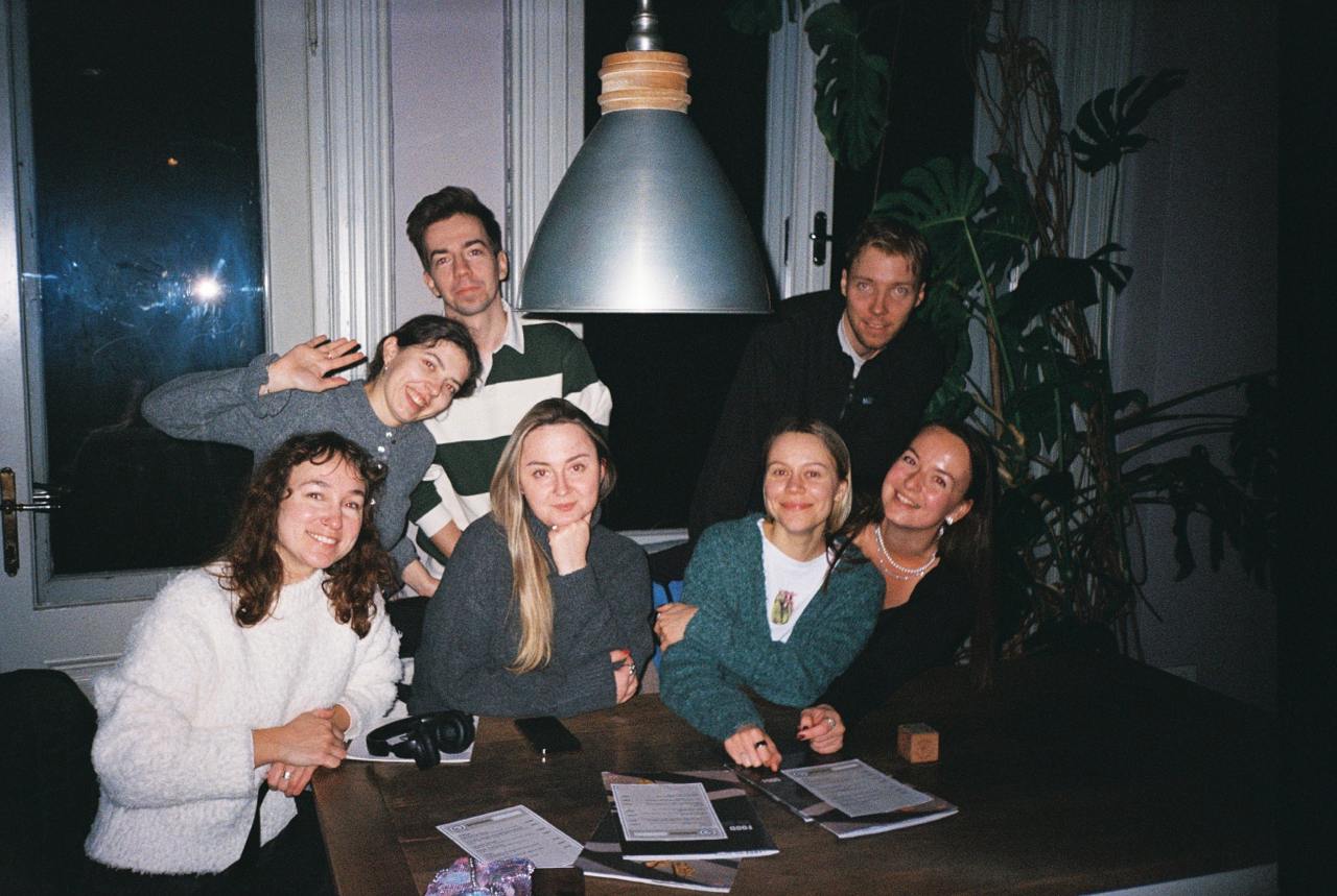
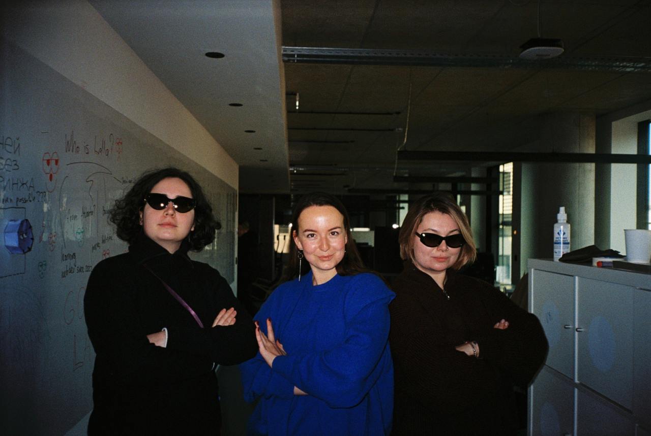
Design in TripleTen was also very diverse. We were organized into three pillars: communication, product, and curriculum design. All treating design as a glue, we collaborated closely, shared a visual guideline, design system, and processes. I’m proud I helped this community of bright folks grow—supporting with rituals, tooling, strategy, and hiring.
Now that you know me a little better, let’s do something cool together. Drop me a line at hey@tonyfresher.com